


A polished interface isn’t just about aesthetics — it’s a business asset. Visitors decide in milliseconds whether a page looks like it can be trusted. And while your UX may be perfectly logical on paper — the two are not the same thing, as we set out in the difference between UX and UI — poor UI can silently erode trust, increase bounce rates, and block conversions before they begin.
At 3MY, we’ve audited a great many websites. These are the most common — and costly — UI design mistakes we see, along with how to fix them fast.
1. Weak Call-to-Action Design
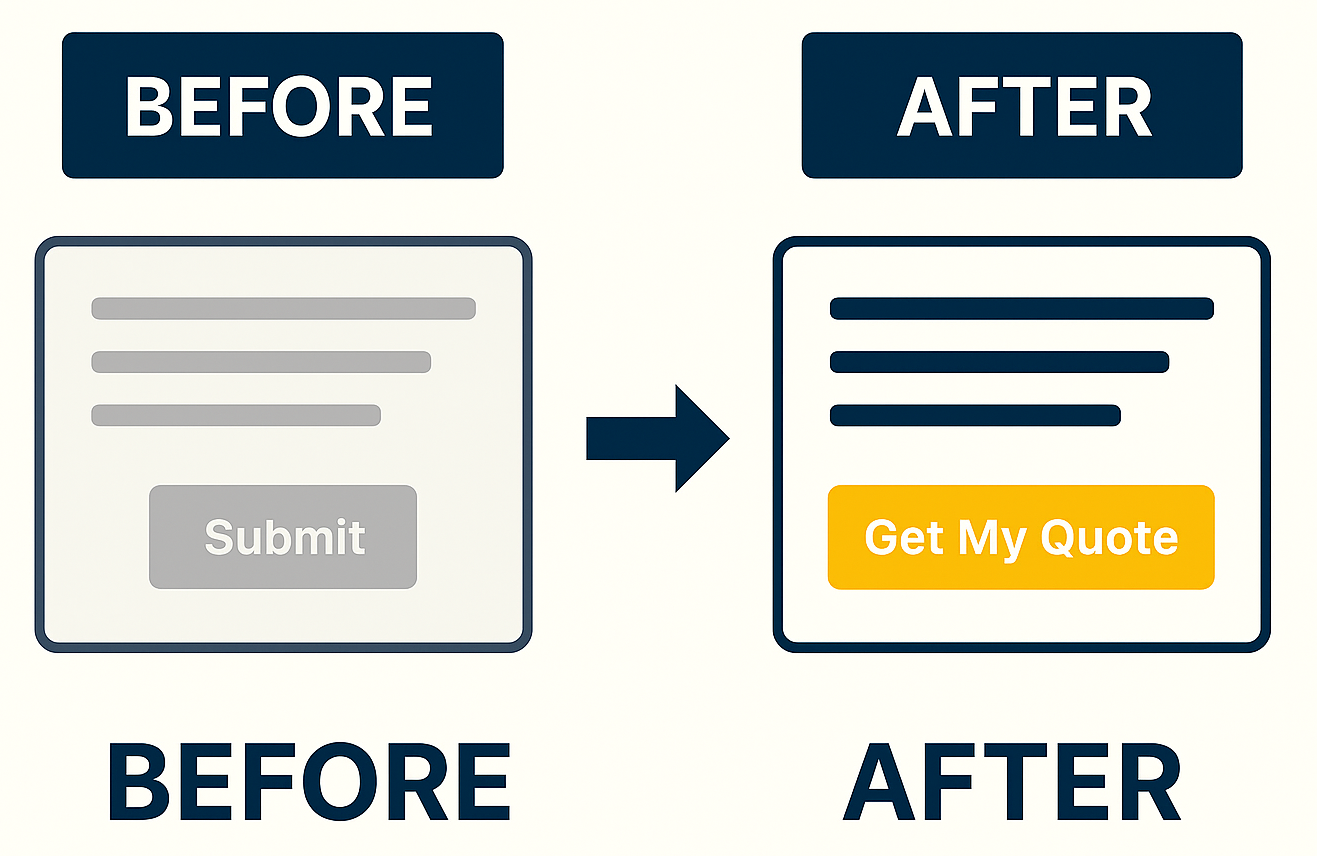
The problem: Your CTA is vague, low-contrast, or buried in the layout.
Why it matters: If users can’t quickly spot what to do next, they simply won’t do it.
Fix it:
- Use bold, high-contrast colors
- Place CTAs above the fold and repeat them contextually
- Use action-oriented language like “Start My Free Trial” instead of “Submit”
- Put it where the page structure already leads the eye — the anatomy of a high-performance landing page covers where that is
2. Inconsistent Spacing and Alignment
The problem: Uneven padding, misaligned elements, and layout shifts create visual chaos.
Why it matters: Visual inconsistency makes your site feel unprofessional — even if users can’t explain why. And a layout that moves while it loads is not only a matter of taste: it is measured. Cumulative Layout Shift is one of the three Core Web Vitals Google reports on your pages, and content that jumps as the page settles is exactly what it records.
Fix it:
- Apply a consistent grid system
- Use spacing tokens for margins and padding
- Double-check pixel alignment across screen sizes
3. Text That’s Too Small or Hard to Read
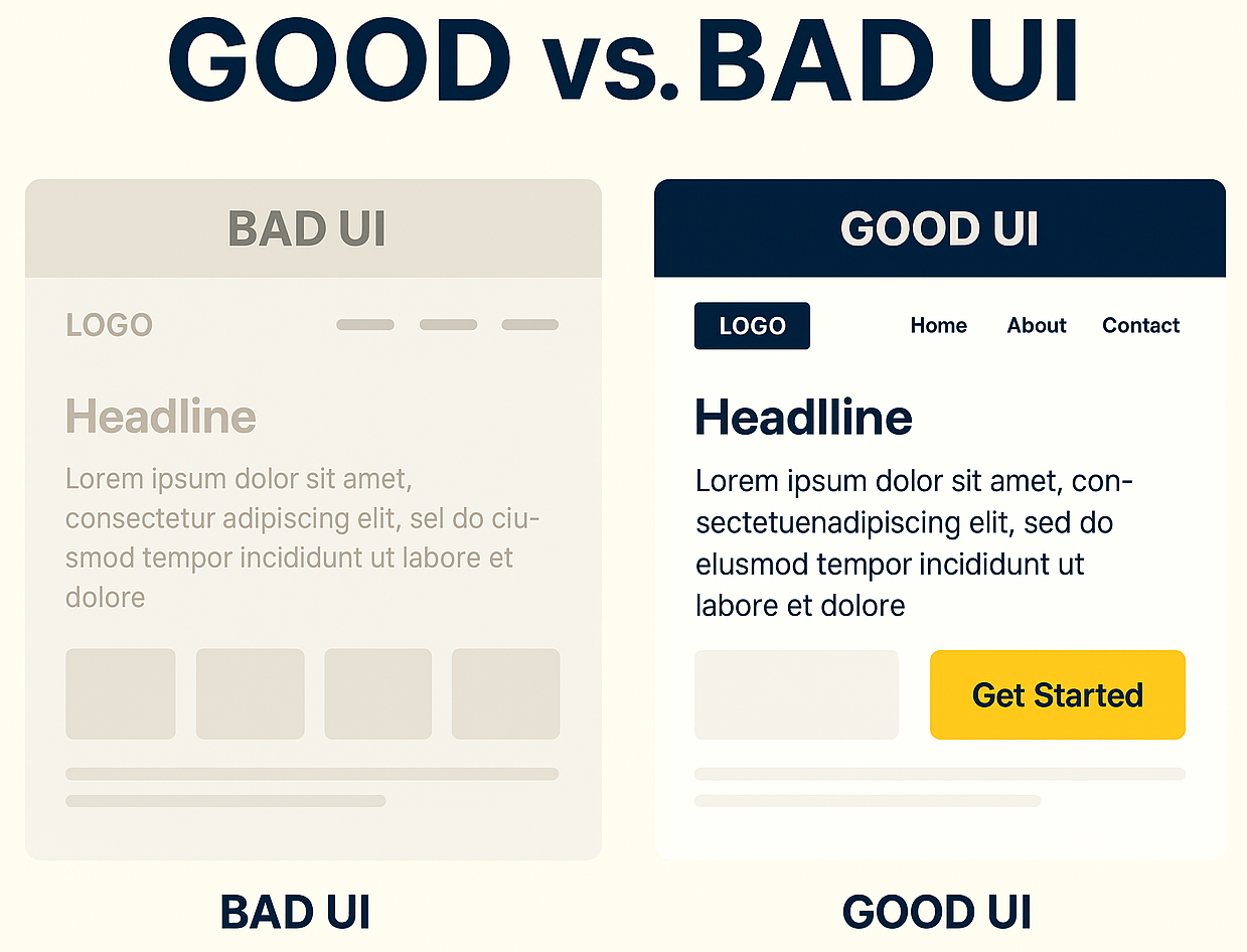
The problem: Fonts are tiny, and color contrast is too low — especially on mobile.
Why it matters: If users struggle to read, they leave.
Fix it:
- Use at least 16px for body text on mobile
- Meet the WCAG contrast minimum — 4.5:1 for normal text, 3:1 for large text
- Stick to clean, dark text on light backgrounds — no gray-on-gray
4. Generic or Irrelevant Imagery
The problem: Stock photos without context or emotional relevance.
Why it matters: Visuals influence perception and trust — irrelevant ones harm both.
Fix it:
- Use real photos of your product, people, or environment
- Add captions that reinforce the message
- Integrate visuals into your conversion story, not just as decoration
5. Excessive or Distracting Animation
The problem: Everything moves — slides, fades, bounces.
Why it matters: Over-animation disrupts focus and slows performance.
Fix it:
- Limit transitions to under 300ms
- Use motion only to guide flow (not to impress)
- Avoid parallax and heavy animation on mobile
- Respect the visitor’s own choice: operating systems expose a reduced-motion setting, and honouring it in CSS is a two-line change
6. Poorly Designed Forms
The problem: Long forms, confusing labels, or fields that don’t work on mobile.
Why it matters: Your form is your conversion. Make it frictionless.
Fix it:
- Use smart defaults, masks, and validation
- Group fields logically and reveal sections progressively
- Optimize for thumb input, autofill and error prevention — WCAG sets a minimum target size of 24 by 24 CSS pixels for anything tappable
7. Unclear Visual Hierarchy
The problem: All elements shout — or none do.
Why it matters: Without hierarchy, users get lost. Confused users don’t convert.
Fix it:
- Limit each screen to one clear action
- Use scale, font weight, and color to guide attention
- Ensure headlines are bold and scannable
- Give the important element room — white space is what makes a hierarchy readable, not decoration
Fixing UI Errors That Cost You Conversions
At 3MY, we don’t chase trends. We design user interfaces that perform — not just impress.
Every decision we make is grounded in one question: Does this help the user move forward?
Whether you need to identify why users aren’t clicking your CTAs, why form completions are low, or why visitors bounce from key pages — we bring structure, clarity, and data-backed improvements.
Here’s how we help:
- CTA Flow Audits – We analyze placement, contrast, copy, and context to boost action rates
- Form Redesigns – We simplify, streamline, and optimize forms to reduce drop-off
- Visual Hierarchy Alignment – We rebuild layout logic so that users instantly know what to focus on
- Mobile UI Tuning – We ensure your site performs beautifully on small screens, where most users live
- Conversion-Focused UI Refresh – We refine your interface to guide users — not distract them
We’ll review your layout, CTA structure, spacing, forms, and design logic — then deliver a focused improvement plan that’s easy to implement and built to convert.
No fluff. Just practical UI that gets results.