


A landing page is often the first interaction a potential customer has with your brand — and the place where interest either turns into action or fades away. A high-performance landing page combines strategic design, persuasive copywriting, psychological triggers, and technical excellence.
This guide breaks down every essential part of a landing page engineered to maximize conversions and deliver measurable ROI.
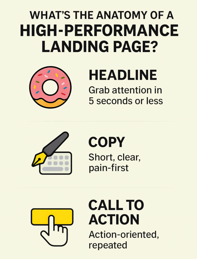
Infographic: Key Building Blocks of a High-Performance Landing Page
1. The Headline: Your First and Most Critical Hook
The headline is the gatekeeper of your landing page. If it doesn’t capture attention immediately, nothing else on the page will matter.
Best practices:
- Be specific and benefit-driven: Make a promise or show the outcome.
- Front-load value: Readers often skim — lead with what matters.
- Clarity over cleverness: Don’t sacrifice understanding for wordplay.
Example:
“Boost Your Sales by 30% in 60 Days — Free Strategy Call.”
Improved alternative:
“Double Your Qualified Leads in Just 3 Weeks — With No Extra Ad Spend.”
2. Supporting Copy: Persuade Without Overloading
Your body copy must guide the user from curiosity to conviction — quickly and clearly.
Best practices:
- Speak directly to the user’s pain points, needs, or goals.
- Use short sentences, plain language, and avoid jargon.
- Break up text with bullets, bold benefits, or subheadings.
- Insert early social proof (e.g., “Trusted by 700+ brands”).
Example layout:
- Frustrated by underperforming ads?
- Tired of spending more and earning less?
- We’ve helped businesses like yours improve their conversion rates in a matter of weeks.
3. Conversion Trigger (formerly “CTA”)
The conversion trigger is your most important interactive element. It turns passive interest into measurable action.
Best practices:
- Make it bold and visually distinct: Use color contrast.
- Use action-driven, first-person verbs: “Yes, I Want My Free Audit.”
- Place multiple buttons throughout the page: header, mid-page, footer.
- Test microcopy around it: Reassurance like “No credit card required” can boost clicks.
Example buttons:
- [Start My Free Trial]
- [Get Instant Pricing]
- [Request My Proposal]
4. Trust Signals: Reduce Anxiety, Build Confidence
Trust is the foundation of conversion. Without it, even the best copy fails.
Must-have trust elements:
- Client testimonials with full names or job titles
- Video reviews for authenticity and emotional impact
- Security badges (e.g., SSL, payment protection)
- Well-known logos (clients, partners, media mentions)
- Privacy compliance and GDPR language near forms
Example:
“Trusted by hundreds of businesses across North America.”
5. User-Friendly Forms: Simplify to Amplify
A cluttered or confusing form kills conversions. Make it easy, make it fast.
Best practices:
- Ask only what’s necessary (name, email, phone if needed)
- Use field validation and inline error messages
- Mobile-friendly layout with large input areas
- Include a short line of reassurance: “We never spam or share your data.”
Tip:
Multi-step forms often convert better than long single-step ones — they feel shorter and more digestible.
6. Design and Visual Hierarchy: Guide Every Click
Design is about flow. Your layout should naturally lead users toward the conversion point.
Key techniques:
- Use visual contrast to highlight important sections
- Leverage directional cues: arrows, images of people looking at your button, etc.
- Whitespace is power — don’t crowd your content
- Ensure scroll-friendly layout: each section should build interest
Also critical:
Fast load times. Use lazy loading, compressed images, and no heavy scripts.
7. Engaging and Relevant Visuals
Visuals should support your message — not just decorate it.
Effective visuals:
- Product or service in action (real-world usage)
- High-resolution images or short explainer videos
- Before-and-after graphics for transformation
- Screenshots with annotations to preview value
Don’t use:
Generic stock photography or abstract illustrations with no relevance to the offer.
8. Mobile Optimization
Over 60% of landing page visitors are mobile users. If it doesn’t work beautifully on mobile, it doesn’t work.
What to optimize:
- Use legible font sizes (16px+)
- Buttons should be thumb-friendly (at least 44px tall)
- Minimize initial page weight (under 2MB if possible)
- Ensure forms work without zooming or horizontal scroll
Tip:
Preview your mobile version first — not last.
9. Minimal Navigation and Distractions
Landing pages aren’t websites. They’re conversion environments. Every link away is a lost opportunity.
Best practices:
- Remove top and side navigation completely (except legal links)
- Avoid unnecessary exit links, ads, or pop-ups
- Use single CTA focus: one action, one result
- Let the funnel stay narrow to maximize impact
Optional:
Use exit-intent popups as a fallback — but only if timed properly and mobile-optimized.
10. Privacy Policy and Legal Compliance
Visitors are more cautious than ever. Reassurance about their data builds trust and prevents drop-off.
Make sure you:
- Include a privacy policy link near all forms
- Add a checkbox for consent if storing personal data
- Clearly state: “We never share your data. Unsubscribe anytime.”
- Comply with GDPR, CCPA, and local laws — especially for remarketing or email follow-up
Continuous Testing and Optimization: What Separates Good from Great
No landing page is “done.” Even high performers can improve.
Best practices:
- Use heatmaps and session recordings (Hotjar, Microsoft Clarity)
- Run A/B tests on:
- Headlines
- Button colors and wording
- Form length
- Hero visuals
- Track:
- Drop-off rate by scroll depth
- Time to first click
- Exit intent and bounce rate
What to look for:
- Where users hesitate
- Where they skim vs. stop
- What elements actually drive the action
About 3MY
3MY is a performance-first digital agency focused on one thing: results.
We specialize in building high-converting websites, managing Google Ads with precision, and optimizing every step of the user journey. Our team blends data analysis, UX/UI design, and conversion psychology to help businesses unlock their full digital potential.
Whether you’re launching a new product, scaling your e-commerce store, or refining an existing funnel, we bring the systems and strategies that move real metrics — not vanity ones. Every page we build and every campaign we manage is guided by a simple principle: clarity, control, and conversion.
Our core services include:
- Custom website and landing page development
- Full-funnel Google Ads management and optimization
- Conversion rate optimization (CRO) based on user behavior and A/B testing
- Strategic analytics setup and reporting across GA4, GTM, and CRM tools
We don’t deliver packages — we deliver outcomes. Our clients come to us for scalable systems, transparent reporting, and long-term growth — and they stay for the performance.
Take the Next Step: Let’s Build Something That Converts
If you’re investing in traffic, every click should count. A high-performance landing page can double your leads, lower your ad costs, and drive more qualified business. But it starts with the right strategy.
Book a free consultation with the 3MY team.
We’ll review your current page, audit your funnel, and give you concrete recommendations — no fluff, no pressure.
Let’s turn your landing page into your best-performing sales tool.