


Search “ada compliance website” and most of what comes back reads the same way: a glossary entry on what ADA means, a paragraph on levels A, AA, and AAA, a line about lawsuit risk, and a button to buy a fix. None of it tells you which parts of your own site are the ones that matter, or why the rule that got the headlines in April 2026 almost certainly isn’t the one that applies to you.
This is the version that starts from your pages instead. Not “what is ADA compliance” — what, specifically, on a page makes it inaccessible, and what a person building that page actually does about it.
What ADA Compliance for a Website Actually Asks of a Page
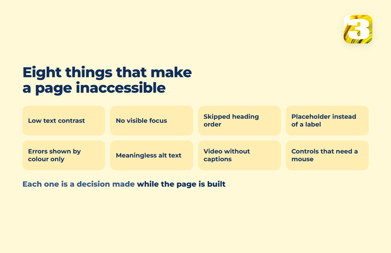
Set the law aside for a moment. Regardless of which rule technically applies to you, these are the things that make a page hard or impossible to use for someone relying on a keyboard, a screen reader, or reduced vision — and they’re the same list whether you’re covered by Title II, Title III, or nothing at all.
Contrast between text and its background, and between a button and the page around it. Light gray text on white looks clean to someone with full-color vision and disappears for someone who doesn’t have it. The same goes for a button whose color barely separates from the section it sits in — it reads as decoration rather than something clickable.
A visible marker when focus moves with the keyboard. Someone navigating by pressing Tab instead of clicking needs to see, at every step, which element is currently active. A lot of sites strip that outline out for looking “cleaner” and never replace it with anything — which means keyboard navigation still technically works, but nobody using it can tell where they are.
Headings in actual order. An H1, then H2s, then H3s under them — not an H3 picked because it happens to render at the font size someone wanted for a subtitle. Screen readers let a person jump between headings the way a sighted reader skims a page; when the order is chosen for size instead of structure, that map stops making sense.
A real label on a form field, not just a hint that lives inside it. Placeholder text that reads “Email” inside the box looks fine until someone starts typing, at which point it disappears — and a screen reader doesn’t reliably announce it the way it announces an actual label. Leave the field blank and submit, and the person filling it out has no record of what was being asked.
An error that isn’t communicated by color alone. A field that turns red when something’s wrong tells a sighted, non-colorblind visitor exactly what happened. It tells nobody else anything. The message needs to exist as text, tied to that field, not just as a shift in border color.
Alt text that describes what’s actually in the frame. Not the file name, not a repeated keyword, not “image” left blank by default — a short, accurate description of what the image is doing on that page. A photo that’s purely decorative should get an empty alt attribute on purpose, so a screen reader skips past it instead of reading out something meaningless.
Captions on video, synced to what’s being said. This serves people who are deaf or hard of hearing directly, and also covers the much larger group of visitors watching with the sound off.
Every interactive element working without a mouse at all. Dropdowns, filters, modal windows, date pickers — each one needs a way to be opened, used, and closed using only a keyboard. This is one of the most common places a page quietly fails, because it’s easy to build a component that works perfectly with a mouse and never gets tested any other way.
None of these are abstract. Each one is a specific decision made once, in the markup or in the copy, while the page is being built — which is the part how to test your own site for accessibility walks through if you want to check your own site for it, and what an accessibility audit actually covers if you’d rather have someone tell you exactly what’s wrong and fix it.

Which Rule Applies Doesn’t Change What’s Wrong With the Page
Three different rules cover three different groups — state and local government sites under ADA Title II, private businesses under Title III, and federal agencies and their vendors under Section 508 — and none of them is written for a business operating in Canada, which answers to its own rules instead — the two that actually name a standard being a federal regulation covering banks, telecom, broadcasting and interprovincial transport, and a provincial one in Ontario with a threshold by employee count. Only some of these name a technical standard at all; Title III, the one most private businesses in the US fall under, doesn’t. Which one is actually yours depends on who you are, not on how your site is built, and the full map — who falls under what, and which WCAG version each one names — is in which accessibility rule applies to you.
One piece of that map is worth pulling forward, because it gets misquoted constantly. In April 2026 the Department of Justice extended the Title II deadlines to April 26, 2027 and April 26, 2028. Those dates belong to state and local governments. A fair share of what currently ranks for ADA searches presents them as a general deadline everyone has to hit — they are not, and no extension of them changes anything about a private site.
The rest of this article stays on the page itself.
When the Problem Isn’t Your Code at All
There’s a category almost nothing written on this topic touches: the parts of a page that aren’t built by whoever built the site.
A booking widget, a chat bubble, an embedded map, a payment step handed off to a processor — each of these usually arrives as a piece of code from a third party, dropped into an iframe or a script tag. When one of those pieces has a keyboard trap, a contrast problem, or an unlabeled button, the person who built the surrounding site can’t simply open the code and fix it, because it isn’t their code. It belongs to the vendor.
What actually changes something in that situation is one of two things: a support request to the vendor, pointing at the specific problem, since some of them do maintain accessibility roadmaps and will act on a concrete report — or replacing that tool with a different one that handles it properly. A patch layered over someone else’s script is a third option only until that script updates.
This shows up constantly at checkout — a payment step embedded from a processor, a shipping calculator, a size-guide pop-up — which is exactly the layer covered in store builds, because it’s where a store’s accessibility problems tend to live: not in the product page someone wrote, but in the four steps that happen after “add to cart.”

Overlay Widgets: What They Actually Do
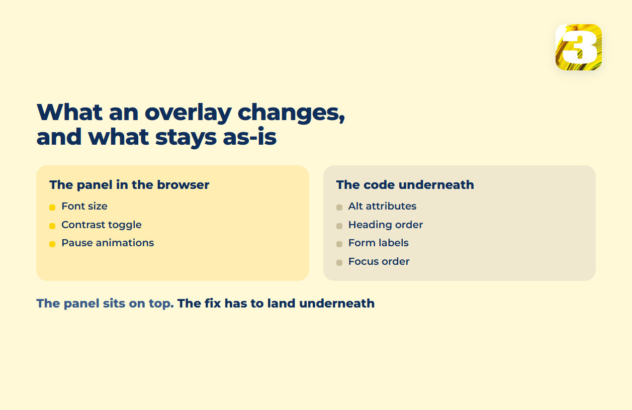
At some point in researching this, most people run into a script that promises to make an existing site compliant by adding a small panel in the corner — font size controls, a contrast toggle, an option to pause animations, sometimes a claim that it can rewrite the page automatically. It’s worth being precise about what that script actually does.
Mechanically, an overlay is a snippet of code loaded on top of an already-built page. It runs in the visitor’s browser, gives that visitor a settings panel, and in some versions attempts automated changes — inserting alt text using image recognition, for instance. What it doesn’t do is rewrite the underlying page: the heading structure, the actual alt attributes in the markup, the keyboard focus order, and the form labels are whatever they were before the script loaded. The panel changes what’s rendered on top; it doesn’t touch the code underneath it.
The ADA’s own guidance on this is worth quoting directly rather than summarizing, because the actual wording is more careful than most of what gets written about it: “Automated accessibility checkers and overlays that identify or fix problems with your website can be helpful tools, but like other automated tools such as spelling or grammar checkers, they need to be used carefully.” The same page adds a line worth sitting with: “A ‘clean’ report does not necessarily mean everything is accessible.”
There’s also a specific, dated regulatory case worth knowing about. In January 2025, the Federal Trade Commission filed a complaint against the maker of one such tool, alleging that its claim to make any website compliant with WCAG was false or unsubstantiated, and that reviews written by people with an undisclosed material connection to the company had been presented as independent. A final order was approved in April 2025: a $1,000,000 payment, and a prohibition on claiming that an automated product makes a site compliant with WCAG, or keeps it compliant over time, without evidence to back that up. That’s a finding against one specific vendor’s specific marketing claims — not a ruling on overlay tools as a category, and it shouldn’t be read as one.
One more fact worth having on hand: nobody certifies ADA compliance. There’s no badge, seal, or government-issued mark that says a site “is ADA compliant,” because no body — not the DOJ, not W3C — issues one.
We install these panels for clients who specifically want that layer on their site. The panel works on what is rendered; the labels, the headings, the contrast and the focus order live in the page itself, and that is the layer we work on. And if a letter referencing any of this has already landed in your inbox, what actually triggers a web accessibility lawsuit covers what to do with it first.
Where to Start If Your Site Fails Most of the List
Nobody clears all eight items in an afternoon, and not all eight cost the same to leave alone. A useful order, when there’s more to fix than there is time this week:
First, anything that stops a task from being completed at all. A keyboard trap in a popup, a checkout step that can’t be reached without a mouse, a form field with no label. These aren’t degraded experiences — they’re a closed door, and they’re also the items a stranger reviewing your site will reach first.
Second, anything on the page people actually came for. A contact form, a booking calendar, a product page. Fixing the About page before the form is effort spent where it changes the least.
Third, the things that make the site harder rather than impossible. Low contrast in a footer, a missing caption on a marketing video, a decorative image with clumsy alt text. Real, worth doing, and not worth doing before the first two.
That order is also what separates an afternoon of work from a rebuild. Most of what’s on the list is a change to markup or to copy on pages that already exist — which is why it costs so much less when it’s part of how a site gets built than when it’s retrofitted two years later across forty pages nobody has touched since launch.
Accessibility Doesn’t Hold Still After Launch
A page that passes every item above on launch day doesn’t stay that way on its own — a new promotional banner without alt text, a swapped hero image, a plugin update that quietly changes how a form renders, each one can undo something that was fine a month earlier. That’s part of what ongoing site maintenance actually covers, not a separate topic.
Where ADA Compliance Sits in How We Build a Site
Contrast, heading structure, form labels, and alt text are decisions made while a page is being laid out and while its copy is being written, and since the text, meta information, and page structure of a site are already part of what a site build costs, the alt text, the heading order, and the form labels are simply part of that same work, not a line item added on top.
The defects above show up differently depending on what a site actually does: an intake form behaves differently from a product catalog, and both behave differently from a booking calendar. The specifics change. The list of things worth checking doesn’t.
If you’re not sure which parts of this apply to your own pages, that’s the same conversation we start every website build with — and a shorter one than most of what’s written about ADA compliance makes it sound.