


Your website might load fast, rank well, and have all the right pages — but still lose visitors before they read a single line.
That’s because trust is visual. It’s subconscious. And it’s immediate.
People don’t “evaluate” websites logically — they feel them. And if what they see doesn’t seem credible, they leave.
So even if your business is great, your product is solid, and your content is strong, none of it matters if your site doesn’t look trustworthy at first glance.
Let’s break down the most common trust-killers — and how to fix them.
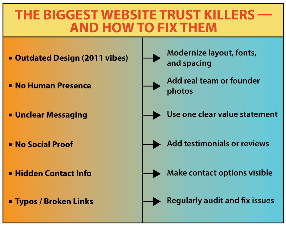
1. Your Website Looks Like It Was Built in 2011
This is one of the fastest ways to lose a lead.
If your design feels outdated, users don’t assume you just haven’t gotten around to redesigning — they assume the business is low-effort, out of touch, or no longer active.
A site that looks like it hasn’t been touched in years sends the wrong message, no matter how great the content is.
What signals “outdated” to most visitors:
- A layout that’s too crowded, with no visual breathing room
- Fonts that are too small, inconsistent, or hard to read
- Non-responsive design that breaks on mobile
- Old-fashioned UI elements like 3D buttons or drop shadows
- A homepage that feels like a wall of text or a PowerPoint slide
Even subtle design decisions can create a subconscious reaction:
What to fix:
- Switch to a responsive, mobile-friendly layout
- Use a modern sans-serif font, with clear sizes and hierarchy
- Limit your palette to 2–3 main brand colors
- Space out your sections clearly — let them breathe
- Make sure the first screen (“above the fold”) is clean, readable, and focused on value
Even without a full redesign, small visual changes can create a major difference in how people feel on your site.
2. There’s No Real Person Behind It
A website that hides the people behind the business often feels cold, corporate, or automated — especially if it’s full of generic stock photos.
Even if your design is modern, lack of human presence creates doubt.
Buyers want to know:
This is even more important if:
- You’re a freelancer or consultant
- You run a small agency or startup
- You offer any service that relies on personal expertise or communication
What kills trust fast:
- Abstract icons instead of faces
- Stock images of call center workers
- Zero names on the “About” page
- No founder message, intro, or contact person listed
What builds trust instead:
- A real, recent photo of the founder or team
- A short intro (“Hi, I’m Alex. I help businesses…”)
- A named email address (e.g. alex@ instead of info@)
- Casual behind-the-scenes photos from your workspace or projects
You don’t need a full studio shoot — just something real, clean, and honest.
Even one headshot in the footer or “About” page makes your business feel human and accountable.
This is not only about how a visitor feels. Google’s own guidance for site owners asks you to check whether it is self-evident to your visitors who authored your content, whether pages carry a byline where one would be expected, and whether that byline leads somewhere — an author page, an About page with real background. The question a cautious buyer asks silently is the same one Google tells you to ask yourself.
Pro tip:
A 30-second video of you introducing yourself or your team does that job faster than any amount of copy. No script needed — just clarity and eye contact.
3. It’s Not Clear What You Actually Do
Visitors shouldn’t have to scroll, guess, or decode your messaging to figure out what your business offers.
Yet many websites open with vague, abstract language like:
It sounds impressive… but it doesn’t say anything.
And when people don’t immediately understand what you do — they leave.
Not because they’re impatient, but because confusion feels risky.
Visitors are silently asking:
- Am I in the right place?
- Is this for me?
- Can I trust this company to solve my problem?
How long do you actually have? Nielsen Norman Group measured it across a large set of sites: people often leave a page within 10 to 20 seconds, and the first 10 seconds decide most of it. Their conclusion is blunt — to earn several minutes of someone’s attention, you have to communicate your value proposition within 10 seconds. Pages that clear that bar hold people far longer.
How to fix it:
Focus on clarity over cleverness.
Instead of:
Say:
Make sure your homepage clearly communicates:
- What you offer
- Who it’s for
- What’s the benefit
- What to do next
This can be done in one sentence + a call-to-action button.
The goal isn’t to sell everything upfront — it’s to reassure people they’re in the right place.
Also important:
Use clear headlines, not just pretty visuals. Users skim. If your value proposition is buried in paragraph three, they’ll never read it.
4. Your Website Has No Social Proof
You might offer amazing services. You might be an expert in your field. But if a visitor lands on your site and sees no proof that others trust you — that’s a problem.
People are naturally cautious online. If they don’t know you, they’ll look for clues that someone else does.
What’s missing when there’s no social proof:
- Client testimonials (even short and casual ones work)
- Case studies with real results
- Logos of companies you’ve worked with
- Embedded reviews from the places your buyers actually check — your Google Business Profile, a marketplace in your industry, an app store listing
These elements make a visitor think,
“Okay, other people worked with them and didn’t regret it.”
It doesn’t have to be flashy.
A quote from a client you helped. A simple “Before and After” result. Even a screenshot of a five-star review from your Google Business Profile — it all helps.
Don’t have big clients yet?
Start small. Ask happy clients for one sentence. Use screenshots from email feedback.
What matters is that someone, somewhere, trusted you — and it paid off.
People feel safer when they know they’re not the first to say yes.
One line you should not cross:
Do not write the reviews yourself, and do not let staff write them either. In the United States that stopped being a grey area on October 21, 2024, when the FTC’s rule on consumer reviews and testimonials took effect. It bans buying or selling fake reviews, bans reviews written by officers, managers or employees unless the connection is disclosed clearly, bans company-run “independent” review sites, and bans suppressing negative reviews — with civil penalties for knowing violations.
In Canada the same conduct sits under the deceptive-marketing provisions of the Competition Act, which the Competition Bureau applies to commercial messages dressed up as the impartial opinion of ordinary consumers.
The practical version is short: ask real clients, publish what they actually wrote, and leave the lukewarm ones up. A wall of flawless five-star quotes reads as bought, which is the opposite of the effect you wanted. And reviews earn their keep well beyond the trust badge — they feed search, sales calls and product decisions.
5. Your Contact Info Is Hard to Find
A visitor should never have to hunt for how to contact you.
If they scroll through your homepage and still don’t know how to reach you — that’s not mysterious, it’s suspicious.
Here’s what people look for:
- A visible phone number or email
- A clear contact form
- Basic location info — even just your city and country
- A human name or team introduction
- An “About” page that shows there are real people behind the business
When none of these are present, it raises doubts.
The thought process goes:
“Will they respond if I have a question?”
If you hide your contact options, people assume you’re hiding something else too.
How to fix it:
Make your contact info visible in multiple places — footer, header, and a separate contact page.
If you use a chatbot, don’t let it be the only way to reach you.
Always give people a human option.
Trust grows when people know they can get in touch easily — and that someone will answer.
6. Your Site Has Typos, Broken Links, or Placeholder Text
Nothing kills credibility faster than a sloppy website.
If a potential client clicks through your pages and sees:
- “Lorem ipsum dolor sit amet…”
- Misspelled words or grammar issues
- Broken links
- Half-loaded images
- Pages that clearly haven’t been finished
…it tells them you don’t really care.
And if you don’t care about your own site — why would you care about their project?
What this signals:
- Low attention to detail
- Outdated or neglected site
- Possible security risks if the site isn’t maintained
Even a good design can’t cover for broken or lazy content.
The one technical detail visitors really do notice:
Whether the address starts with https. Chrome has labelled plain-HTTP pages “Not secure” in the address bar since 2018, and Google has said that in October 2026, with Chrome 154, the browser will ask the visitor for permission before the first load of any public site served without HTTPS. The warning is bypassable, but it is still a warning standing between your homepage and the person who just clicked. Certificates are free and most hosts issue them in a couple of clicks.
How to clean it up:
- Do a full content audit at least once per quarter
- Click every link, button, and image yourself
- Update anything that’s missing or incorrect
- Ask a fresh pair of eyes to test your site and give honest feedback
A polished site isn’t about perfection — it’s about showing you’re present, active, and invested.
Quick Check: Does Your Website Build Trust?
When someone lands on your website, they decide in seconds whether to stay or bounce.
And if the site feels confusing, outdated or vague — you lose their attention before they even scroll.
Here’s a quick checklist to spot the weak points:
- Real photos — not stock models with plastic smiles
- Clear message — what you do, who you help, why it matters
- At least one honest testimonial — even if it’s short
- Easy-to-find contact info — phone, email, or at least a name
- No typos or broken links — and definitely no “lorem ipsum”
- Consistent design — fonts, colors, layout that feel aligned
If two or more of these are missing, you’re not just leaving money on the table — you might be quietly pushing people away.
Trust Isn’t Assumed. It’s Designed.
Visitors don’t read every word.
They scan. They judge. They move on fast.
If your site feels modern, human, and focused — they stay.
If it feels messy, generic, or unsure — they’re gone.
So… how does your website really come across?
We Can Help You Find Out
At 3MY Organizational Innovations, we work with businesses that want to grow and look credible doing it.
We build clear, professional websites.
We set up smart automations.
We help Amazon sellers streamline their storefronts.
We know what makes a site feel trustworthy and what kills trust in seconds.
It is also why the words on every page are our job and not homework we hand back to you. A business site of up to eight pages costs $1,900 with us, and the copywriting sits inside that number — structure, the text of each page, the meta titles. That matters right here, because “placeholder text nobody ever replaced” almost always begins as a perfectly reasonable plan to write it later.
If your website feels “off” and you’re not sure why, let us take a look.
No pressure. No upsells. Just real feedback from people who do this every day.
You’ll get:
- Honest insights
- Simple, actionable suggestions
- A better sense of how your site is performing
Let’s make sure your website leaves the right impression.
We’ll get back to you soon.