

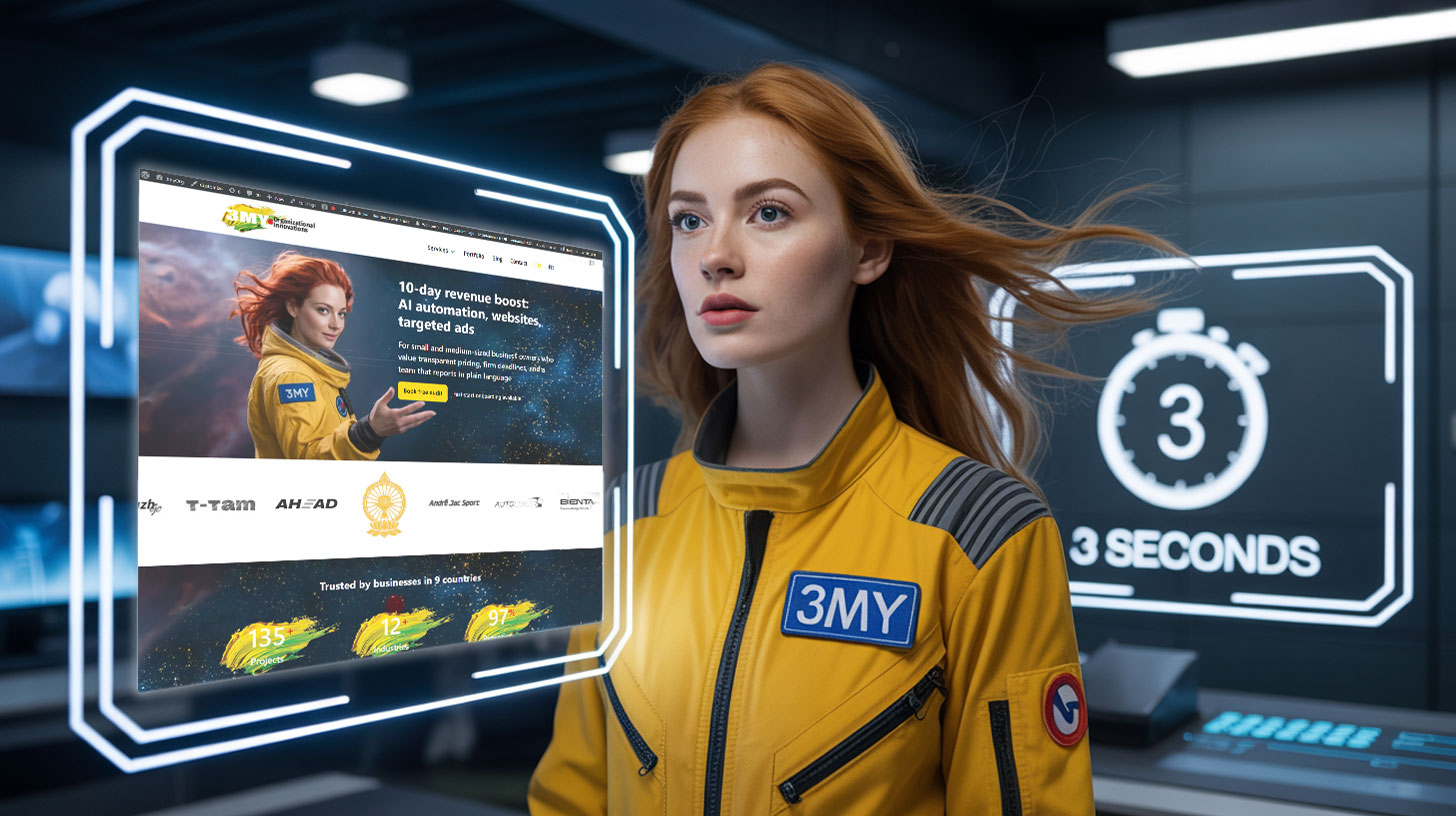
Your homepage loads. The user hesitates. Scroll or bounce?
That decision is made in under 3 seconds.
At 3MY, we help brands improve their conversion rates by getting one thing right: what shows up first.
If your above-the-fold content isn’t clear, relevant, and action-oriented, you’re losing customers before they even engage.
These are the five essential elements we implement — and optimize — for clients to win those first few seconds.
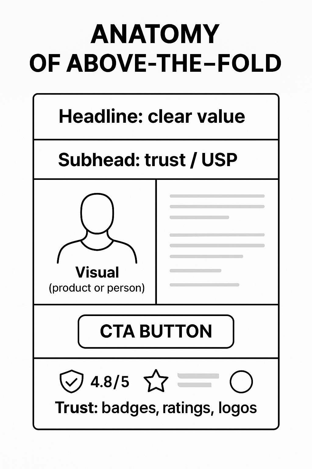
1. A Headline That Answers “Why Am I Here?”
What goes wrong:
- Vague taglines like “Reinventing E-commerce” or “Powering Your Journey”
- No headline at all — just a menu and background image
What we do:
- Write clear, benefit-focused headlines tied to your core offer
- Make it immediately obvious what the page is for
- Test clarity versus curiosity (and when each works)
What the rewrite changes: “Beauty, Reinvented” tells a visitor nothing they can act on. “Clinically Proven Skin Repair in 3 Days” names the outcome, the evidence and the timeframe — three questions answered before anyone scrolls.
2. A Supporting Subhead That Builds Trust
What goes wrong:
- No context about what makes your offer unique
- Jargon-heavy messaging or cliché copy
What we do:
- Add a concise line below the headline that answers: “Why you?”
- Include proof points like certifications, results, or USP
Example:
“Trusted by 12,000+ sellers. Integrated with Shopify, WooCommerce, and Meta Ads.”
That line is invented here to show the shape: one proof point, one compatibility fact, no adjectives. Put your own numbers in it — and only numbers you could show a source for if somebody asked.
3. A CTA That’s Actually Visible
What goes wrong:
- CTA button is below the fold on mobile
- Button says “Learn More” or “Submit” instead of an action
What we do:
- Design mobile-first: CTA always visible within 1 scroll
- Use action verbs: “Get a Free Audit”, “Start My Trial”, “See Pricing”
- Match CTA color to visual hierarchy, not just brand palette
Why persistence matters: a call to action that scrolls away is only available during the seconds a visitor happened to be looking at it. One that stays put is available at the moment they decide — which is rarely the moment they land.
4. Visual Clarity: Images That Support the Message
What goes wrong:
- Distracting background video that delays loading
- Generic stock photos that don’t connect
What we do:
- Use product-centric, real-world images (not filler)
- Ensure mobile doesn’t crop key visuals
- Compress media so the biggest element on the first screen appears quickly — Google calls a Largest Contentful Paint of 2.5 seconds or less good, and it judges that on real visits rather than on your laptop
Speed belongs here rather than in a technical appendix, because it is part of what Google groups under page experience — and because a first screen that has not finished drawing is not a first screen at all.
Bonus: For service businesses, we often test showing a face (founder, client, or team) above the fold to drive emotional connection.
How to Actually Write the Line
Knowing what belongs above the fold is the easy half. Writing it is where most first screens stall, and three old copywriting frames do most of the work — not because they are clever, but because each one forces a different question to the surface.
Problem → Agitate → Solve. Name the thing that is costing the visitor something, make the cost concrete, then show the way out. It suits services where the reader already feels the pain and is looking for someone to end it: “Invoices sitting in an inbox until someone remembers them. Every late payment is a supplier call you have to take. Here is what an approval queue looks like when nobody has to remember anything.”
Attention → Interest → Desire → Action. The oldest frame, and the safest when the reader does not yet know they have a problem. It earns attention with a specific claim rather than a slogan, then narrows toward one action — which is why the CTA has to be the only real invitation on the screen.
Feature → Advantage → Benefit. The one to reach for when the product is technical and the temptation is to list specifications. Take each feature and finish the sentence twice: what it lets the customer do, and what that is worth to them. A spec sheet answers “what is it.” A first screen has to answer “what changes for me.”
Whichever frame you use, the test is the same and it is unforgiving: cover the logo and read the headline. If it could sit on a competitor’s site without a single word changing, it is not a headline yet — it is a category description.
A short checklist before you call the first screen finished. Do: name the outcome, not the aspiration; keep one call to action; make the subhead earn its line by answering the objection the headline raises; write for the phone first, since that is where the sentence will be read in a narrower column. Don’t: open with your own company history; stack two competing buttons; use a hero image that decorates rather than explains; or promise a number you cannot show a source for.
5. Instant Credibility Markers
What goes wrong:
- No social proof, badges, or trust signals visible without scrolling
- Reviews buried at the bottom of the page
What we do:
- Add client logos, review stars, trust badges (SSL, Stripe, etc.)
- Short testimonial quote with name and logo
- Display total user count or results achieved
Example:
“4.8/5 average from 2,100+ verified buyers”
Again, an illustration rather than a claim. A rating that comes from a platform the reader can go and check is worth more than a bigger number nobody can verify.
Bonus: First Impressions Start on Mobile
For most business sites, the majority of first visits now arrive on a phone — check your own analytics before assuming otherwise, since the split varies a lot by industry. Either way it means:
- The first 600px matter more than ever
- Padding, font size, and button placement must be touch-friendly
- Lazy-loaded content delays = lost conversions
We help brands audit their mobile experience and redesign for thumb-first interaction.
How 3MY Helps
We don’t just analyze your above-the-fold content — we transform it.
At 3MY, we specialize in turning first impressions into conversions by combining strategy, copy, and design into a single, optimized experience.
Here’s what we deliver:
- Conversion-Focused Copywriting
Headlines that speak directly to user intent, subheads that build instant trust, and microcopy that nudges action. - Smart Visual Hierarchy & Layout
We map visual flow for clarity and urgency — so the eye lands where the click happens. - CTA Design & Placement That Gets Clicks
From color contrast to button copy, we ensure your CTA is impossible to miss — and impossible to resist. - Mobile-First Optimization
Your message won’t get lost in a scroll. We design above-the-fold experiences that load fast, tap clean, and convert on every screen size. - Speed & Performance Fixes
We compress images, strip slow scripts, and improve load time — because if your site stutters, users bounce. - Trust Layer Implementation
We strategically add ratings, badges, testimonials, and user counts that build confidence in seconds.
One thing worth naming, because it is rarely true elsewhere: the writing is inside the price. When we build a site, the copy for every page — the first screen included — is ours to produce, not a line item you get billed for afterwards and not a template you are handed to fill in yourself.
Every pixel, every word, every scroll — optimized.
FAQs: Above-the-Fold Strategy
Do you test different layouts?
Yes. Layouts, copy, CTA style, image placement — we test what changes the outcome, not what is easiest to change. One warning if you are working from an older guide: Google Optimize, the free tool almost all of them recommend, was shut down on 30 September 2023. Anything built on it stopped running years ago, and a testing plan that still names it was not written for the tools you have now.
Can you redesign our hero section without touching the rest of the site?
Absolutely. Most of our clients start with an above-the-fold audit. We isolate that section, rework it for performance, and leave the rest of your site untouched — unless you ask for more.
How do you measure success?
We track scroll depth, bounce rate, CTR (mobile vs desktop), and overall conversion uplift. Reporting runs on a rhythm we agree with you at the start — and it reports what moved, which is not always the same as what looks good in a chart.
Want to Fix the First Impression?
A large share of visitors decide whether to stay before they ever scroll.
Let’s make sure your brand isn’t one of them.
Book a Free Fold Optimization Call
We’ll review your homepage and key landing pages, identify what’s holding conversions back, and give you actionable solutions — fast. No fluff. No obligation. Just clarity.