

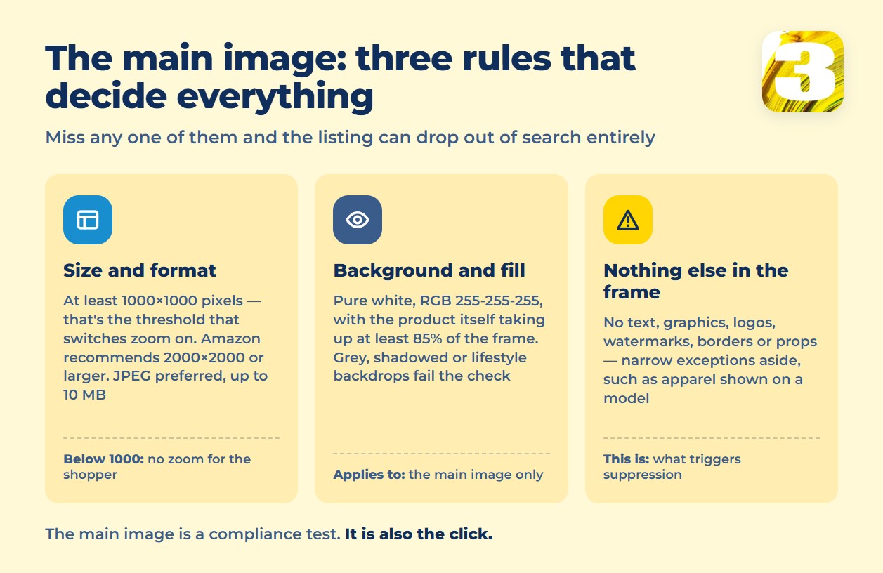
For the main image, Amazon wants at least 1000×1000 pixels — that’s the threshold that turns on the zoom feature shoppers use to inspect a product before buying. Amazon recommends going higher, 2000×2000 pixels or more, because the extra resolution improves how the zoom renders. The background has to be pure white (RGB 255, 255, 255), and the product itself needs to fill at least 85% of the frame. Miss any of the three and the listing can lose its main image spot or get pulled from search entirely.
This article is a deep dive into the technical side — dimensions, formats, video specs, and what specifically triggers suppression. It’s one piece of a bigger picture: if you want the other six factors that affect listing visibility (title, bullets, backend keywords, and more), our earlier rundown covers those separately.
Main image requirements at a glance
One honest note before the table: Amazon’s full image policy lives on a Seller Central page locked behind seller login, so it can’t be quoted directly. Every number below is checked against at least two independent seller guides that reference that policy — not pulled from a single source.
| Requirement | Spec |
| Minimum size | 1000×1000 px (zoom threshold) |
| Recommended size | 2000×2000 px or larger |
| Background | Pure white, RGB (255, 255, 255) |
| Product coverage | At least 85% of the frame |
| File formats | JPEG (preferred), TIFF, PNG, GIF (no animation) |
| Max file size | 10 MB |
What’s banned on the main image — and why extra photos are different
The main image is meant to show the product alone, the way it would sit on packaging in a catalog. That rules out text, graphics, logos, watermarks, borders, and props or extra objects in the frame — with narrow exceptions for categories like apparel, where a model is expected. A mug photographed next to a stack of books, or a speaker shot with a “Best Seller” badge baked into the image, both break the rule.
The other seven to eight image slots work differently. Amazon doesn’t enforce a white background or a coverage percentage on secondary images — that’s where lifestyle shots, alternate angles, size comparisons, and close-ups on texture or material belong. A grill in someone’s backyard, a backpack shown from three angles, a supplement bottle next to its dosage chart: all of that belongs outside the main image, not inside it.
How many images shoppers actually see
Sellers can upload up to nine images per listing, but shoppers rarely scroll through all nine. On desktop, Amazon shows the first seven images by default — and only six if a video has been added, since the video takes one of the visible slots. Anything past that point sits in the gallery but gets far less attention.
The practical takeaway: order matters more than count. The image right after the main photo should answer the question a shopper is most likely to have — what’s included, how big it is, how it’s used — not whichever shot happened to be taken last. A ninth image nobody scrolls to reach isn’t doing any selling.

Video specs, if you’re adding one
Video takes a slot in the default gallery, so it needs to earn its place.
| Requirement | Spec |
| Format | MP4 or MOV |
| Codec | H.264 or H.265 |
| Minimum resolution | 1280×720 (1920×1080 recommended) |
| Aspect ratio | 16:9 |
| Length | 6–45 seconds (15–30 seconds works best) |
| Frame rate | 23.976 or 30 fps |
| Max file size | 500 MB |
| Audio | AAC, PCM, or MP3, 96 kbps or higher |
A video that runs long or buries the product in the first few seconds costs a visible slot without earning attention back — the same logic as image order above.
What actually pushes a listing into suppressed
Two image problems come up again and again in suppression cases: a main image that isn’t on a true white background — gray, shadowed, or shot against a lifestyle backdrop — and any text, logo, or watermark sitting on top of the main image. Both are easy to miss when a photo looks clean on a phone screen but fails the pure-white check on review.
Suppressed means the listing effectively disappears from search and browse — it isn’t ranked lower, it’s not shown at all until the issue is fixed. That’s a different mechanism from a lost Featured Offer (Buy Box), where the “Add to Cart” button can disappear on a listing that still shows up in search; sellers have documented both situations at length in Amazon’s own seller forums. For a seller running paid traffic to the listing, the ad spend keeps going while the organic side of the page goes dark.
Why the main image also moves your ad costs
The main image isn’t only a compliance checkbox — it’s the first thing a shopper sees in the search grid, before they click anything. A sharper, better-lit main photo against true white earns more clicks at the same ad position, and click-through rate is one of the biggest levers on what a click actually costs, since Amazon only charges advertisers when a customer clicks the ad in the first place. Amazon’s own guide to ad performance puts the industry-average return at roughly 2:1 — a number that shifts noticeably depending on whether the image doing the selling is on-spec or not, as covered in Amazon’s ROAS guide.
We go deeper into how that plays out on cost per sale — the metric most sellers actually get billed against — in our guide to Amazon advertising cost of sales.
For sellers who’d rather have the technical side handled — correct dimensions, true white backgrounds, image order built around what shoppers actually see — 3MY’s Amazon listing design service builds listings to these specs from the start.