


Product photos are usually the single heaviest thing on a store’s page — heavier than the theme, the scripts, and the fonts put together. A 12-megapixel photo straight off a phone lands in the megabytes, not the kilobytes. Multiply that by six angles on a product page and a grid of thumbnails on the category page above it, and a store can end up moving far more data than the shopper ever sees drawn on screen. The fix isn’t fewer photos or worse ones. It’s photos sized and formatted for what a browser needs, not for what a camera happens to produce.
None of this requires a redesign or a new platform. Three changes — dimensions, format, and how the file gets delivered — do almost all of the work, and the order matters: doing them in the wrong order means spending an afternoon on the setting that saves the least.

Where Product Image Weight Actually Comes From
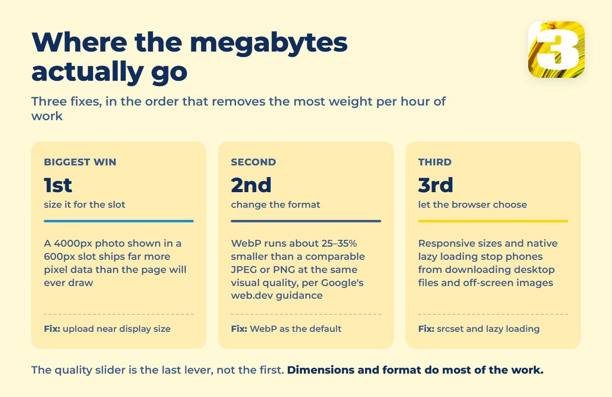
Most bloated stores share the same habit: the original upload is much bigger than the space it’s shown in. A camera photo at 4000px wide, displayed in a 600px product-page slot, is carrying more than 40 times the pixel data the page will ever draw on screen — a 12-megapixel original against a slot that shows roughly 0.3 megapixels. The browser still has to download the whole file before it can shrink it.
WooCommerce, for example, registers three sizes for every product photo you upload — a 300px square thumbnail for grid pages, a 600px image for the single product page, and a 100×100 gallery thumbnail — and generates them automatically from whatever you upload. If the original file is a clean, reasonably sized image to begin with, those generated sizes stay light. If the original is a 12-megapixel camera file, some themes and blocks still request it directly, and the automatic resizing doesn’t save you. The safest habit: upload close to the largest size your design actually shows, not the largest size your camera can produce.
Format Beats the Compression Slider
Most people think “optimizing an image” means dragging a quality slider from 90% to 60%. Format choice moves the needle further. WebP typically runs 25–35% smaller than a comparable JPEG or PNG at the same visual quality, according to Google’s web.dev guidance, which cites that range from Facebook’s own rollout — and every major browser sold today decodes it natively, so there’s no fallback logic to maintain anymore. AVIF can shrink files further still, but it takes longer to encode and its browser support trails WebP by a step, so it’s better suited to hero images than to a catalog of thousands of SKUs where encoding time adds up.
| Format | Best for | Trade-off |
| JPEG | Photos, wide legacy support | Larger than WebP at the same quality |
| PNG | Transparency, flat graphics | Much larger for photos |
| WebP | Default for most product photos | Rare edge-case browser gaps |
| AVIF | Hero images, low-traffic pages | Slower to encode at scale |
| SVG | Logos, icons | Not usable for photos |
For manual work on a handful of images, Squoosh — a free tool built by Google’s Chrome team — lets you drag a file in, compare the compressed version side by side with the original, and export in WebP or AVIF without installing anything. For a catalog of hundreds or thousands of SKUs, that’s a job for a plugin or a build step, not a browser tab.
Why This Isn’t Just Housekeeping
Image weight shows up directly in Largest Contentful Paint, one of Google’s Core Web Vitals. On a product page, the LCP element is almost always the main product photo, and Google’s own documentation sets 2.5 seconds as the threshold for a “good” score — measured on real visitors, not a lab test. An unoptimized hero image is the single most common reason stores miss that number, and Core Web Vitals are part of the page experience signals Google uses in ranking.
The user-behavior side of this is older but hasn’t reversed. In a 2016 analysis of roughly 3,700 mobile sites, Google’s own analytics data found just over half of visits were abandoned once a page passed three seconds to load. That’s dated and it wasn’t eCommerce-specific — but pages have only gotten heavier since, not lighter, so the pressure it describes hasn’t gone away. What a shopper decides to keep looking at in the first three seconds depends on whether anything has actually rendered by then.
Product Image Sizing and Delivery, Without Extra Plugins
Two things do most of the remaining work, and neither requires custom code anymore:
- Responsive images (
srcset) let the browser choose which size to download based on the visitor’s screen — a phone doesn’t pull the same file as a desktop monitor. Most current WordPress and Shopify themes generate this automatically once the underlying images exist at multiple sizes. - Native lazy loading (
loading="lazy") delays images below the fold until a visitor scrolls to them, which is now built into browsers rather than something a plugin has to fake.
A CDN handles the last piece: serving the same optimized file from a server physically closer to the shopper. Every Shopify plan includes CDN delivery — the storefront CDN is backed by Cloudflare — while WooCommerce stores typically sit behind Cloudflare, BunnyCDN or a similar provider you pick yourself. The platform you’re on has already made some of these decisions for you — we cover more of that trade-off in our comparison of WooCommerce and Shopify for online stores.
What Tends to Break the Fix Later
Image optimization isn’t a setting you turn on once. The two moments it quietly reverses:
- A platform or theme migration. Old images get re-imported at their original camera resolution because the migration tool copies files, not settings.
- A new team member uploading photos. Without a documented size and format, the next batch of product shots goes up exactly as the camera exported them.
Checking a handful of recently added product pages after either event catches most of the damage before it spreads across the catalog. A migration is also the point where this stops being a plugin question: if a move to a new platform or theme has already re-imported a whole catalog at camera resolution, sorting that out properly is part of an e-commerce rebuild, not something a compression plugin fixes after the fact.
Sizing images at upload, rather than fixing them page by page later, is the same “when A happens, do B” pattern behind any process worth automating — and whether it’s worth wiring up depends on how often new photos actually arrive.
If your store’s image setup needs more than a plugin — a genuine rebuild of how photos are sized, delivered, and generated at upload — that’s part of what we handle in e-commerce website development, where our standard build is quoted as a fixed price up front rather than by the hour.